
Rebranding for Ukrainian Music Fair, the main and one of the oldest industry events (25 years old, no joke), promised lots of challenges and tough negotiations — for the old style was, uhm, really old-fashioned. Unexpectedly and fortunately, the process turned out to be pretty smooth and some really bold (as for this institution) solutions have been implemented.
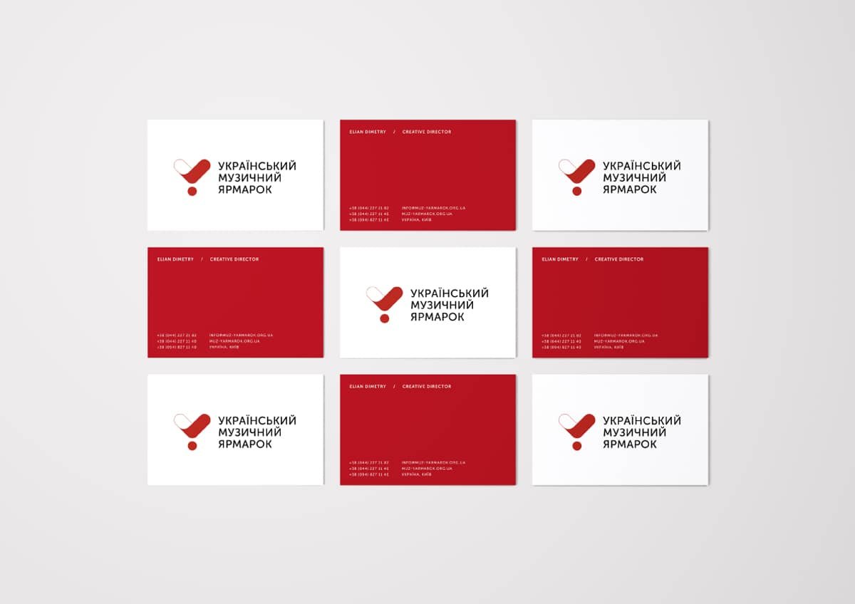
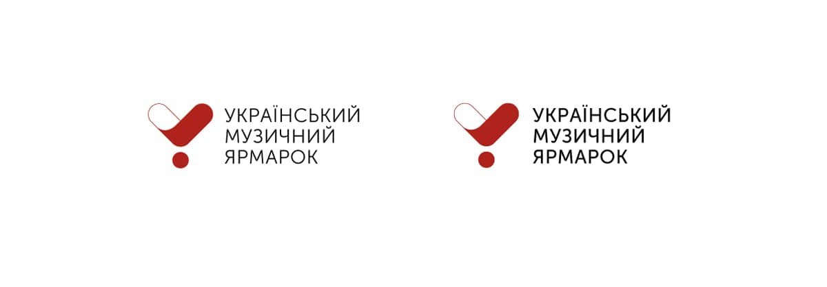
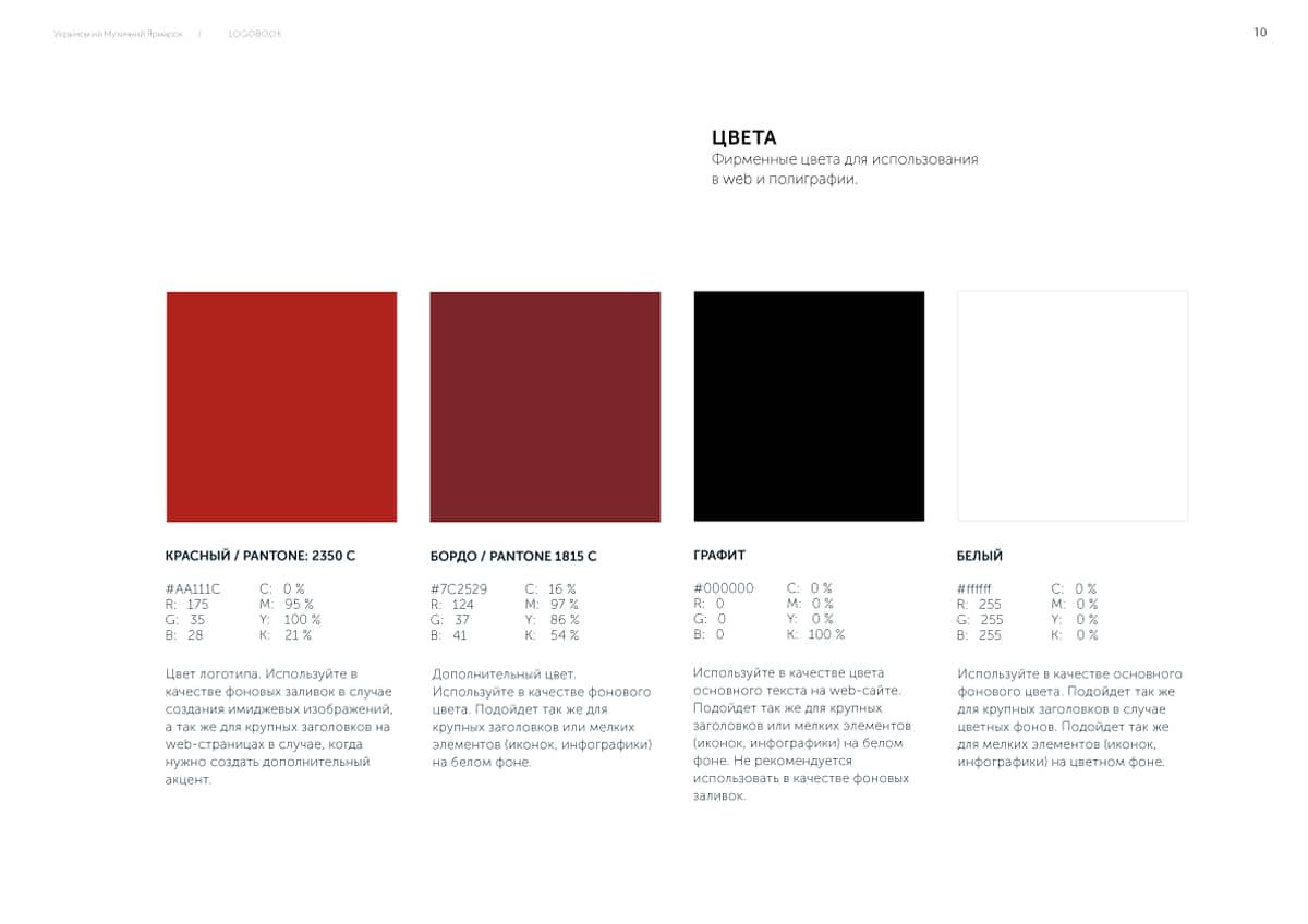
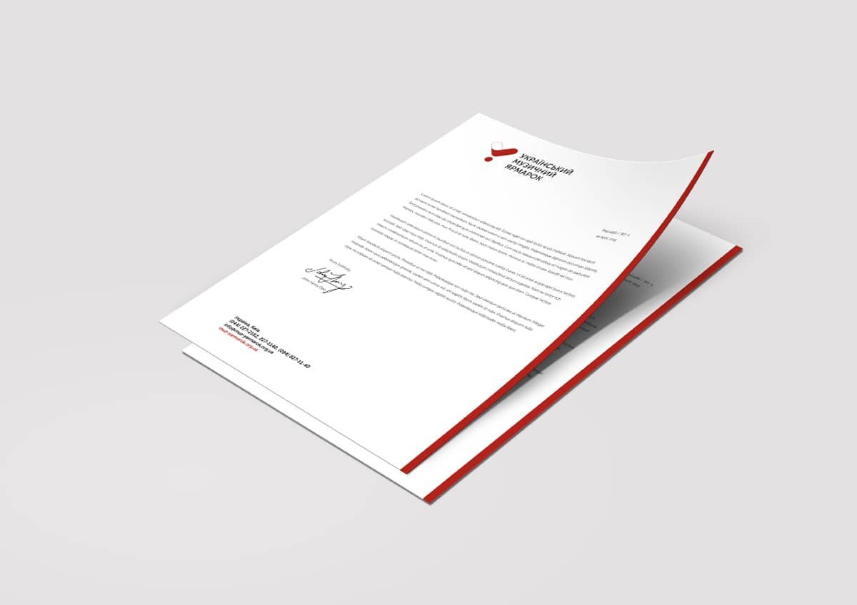
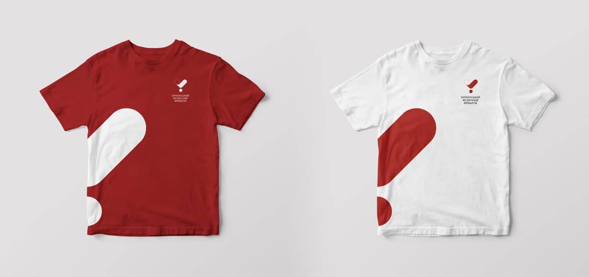
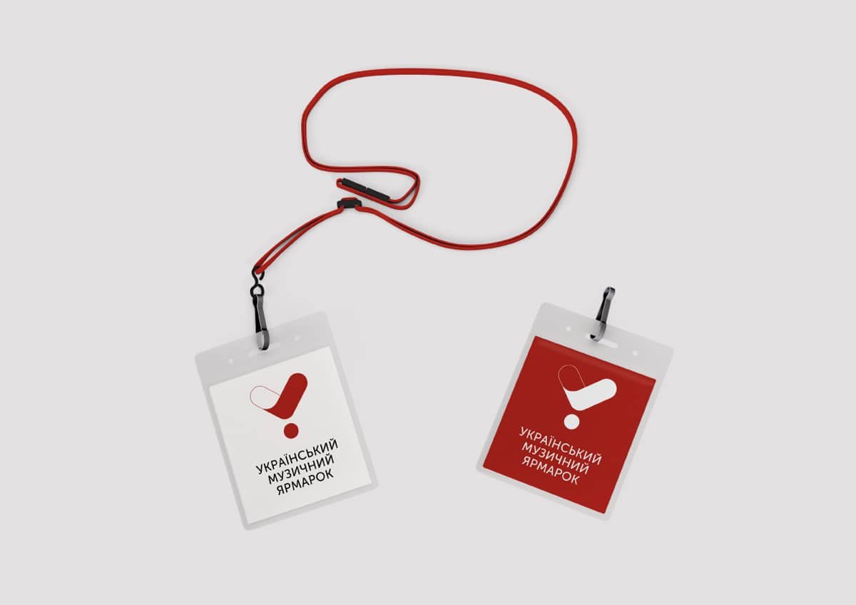
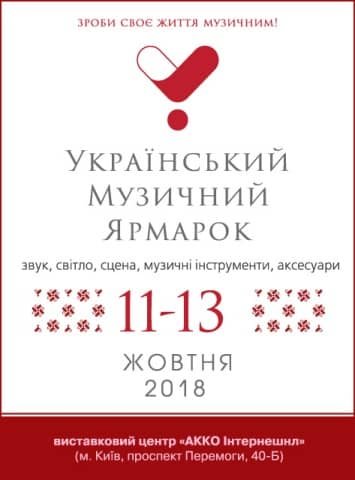
What we did is fixed the logo a tad —a heart shaped hybrid of the exclamation sign and the check mark, it was quite good the way it was, we just eliminated the uncomfortable gradient. We substituted a serif font with the new one, more neat and laconic Museo Sans, and kept the warm dark red palette. As a result of this delicate touch we have gotten the logo that looks moderate and classic enough, but still much more actual.


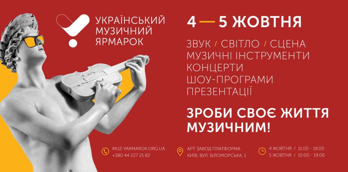
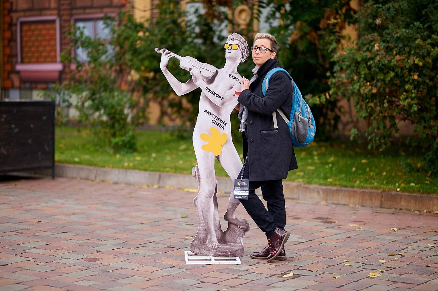
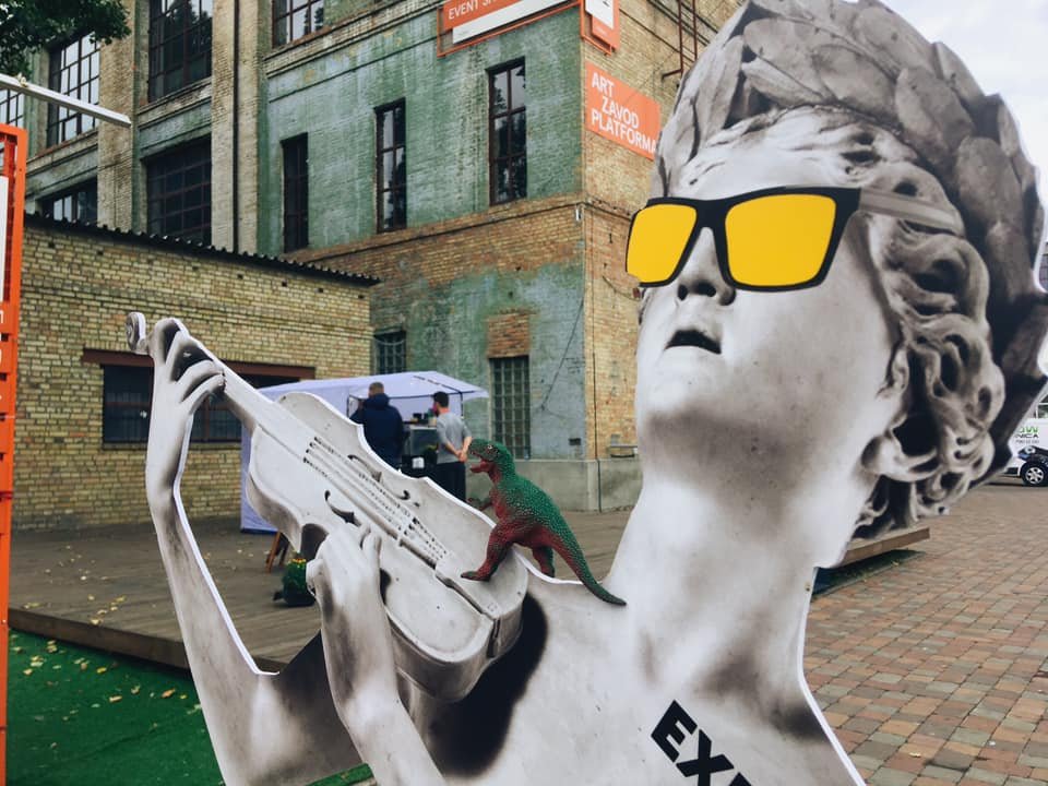
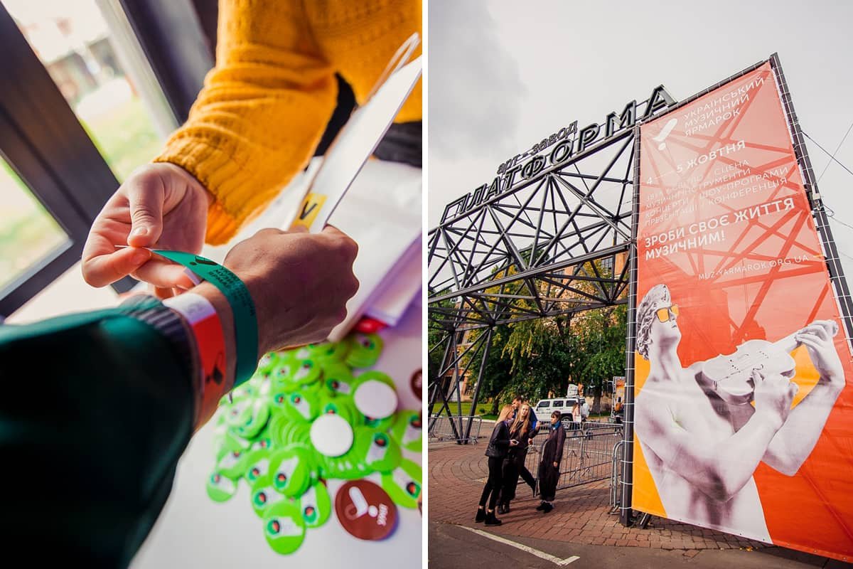
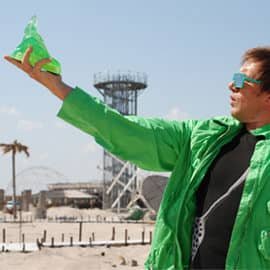
We do always say that frolicking is our trademark style and we manage to drag it into everything we do, no matter how conservative people we work with are. Here, dealing with the 25 year old company, we turned to classics (again) and used Orpheus by Cristoforo Stati (1600), belonging to Metropolitan Museum, as an element of the event’s ID. (Orpheus is a sponsor of music arts, you know it, rigth?) In order to give it a modern twist, we got the cool classical Gucci wayfarers for our hero — we honestly didn’t expect it, but the client appreciated. ;]
5 tattooed Orheuses served the venue logistics.


