The task was creating a brand name and а brand ID for an educational platform for startups where founders and high level managers can learn marketing (and other necessary skills – in the phase II); go through a bootcamp and develop their strategy, as well as find people able execute it.
Markets: USA, Worldwide.
Key notions: Community / Education / Learning / Knowledge / Improvement / Marketing.
Desirable image: Entrepreneur spirit / Smart & Intelligent / Geeky / With a sense of humor / Think big, Dream big / Focus on impact (build things that people really need).
NAMING
The idea was to coin a name for another global social trend and a huge tribe of ‘startuppes’ all around the world, using the analogy and consonance with ’yuppie’ and ‘hippie’, and its benefits — such as popularity in the world’s culture and catchiness. (It is really catchy: next time you would need to use ‘a start-up founder’, you’ll say ‘startuppie’ instead.)
Being a community’s descriptor, it’s generic and focuses on people and their characteristics—therefore it’s global, universal and wide enough to expand the project’s field on later stages (beyond just marketing). Unlike of majority of very serious projects of that kind, the name is playful, easy and unpretentious.
VISUAL CONCEPT
The idea behind the visual concept is: any true startup is innovative. It’s something that has never been done before, and thus, any true startuppie (a person starting up an innovative business) is an explorer stepping into a totally new territory with totally unknown rules and laws. They are literally comparable to an astronaut in the weightlessness of outer space—there are confusion and excitement of a challenge; vertigo from own courage; lightness, and total loss of coordination that takes learning how to abide in it and manage it, in order to feel stable and confident.
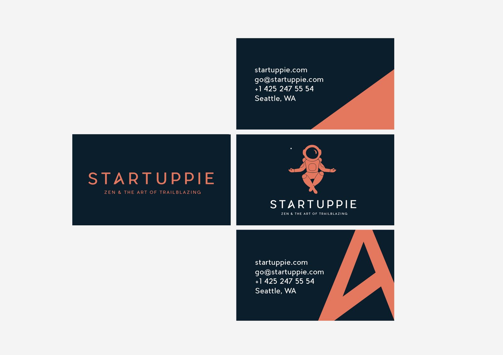
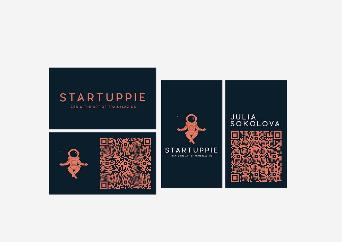
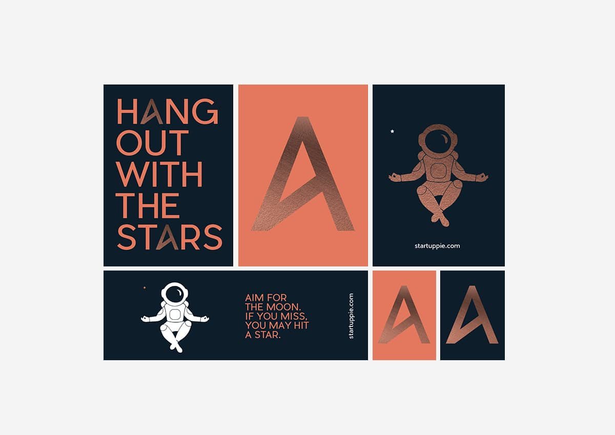
So ‘a hero’ of the brand ID is an astronaut levitating in the outer space in a relaxed lotus-like pose, known as the pose of meditation. The main idea is about finding comfort and confidence in the situation of total unknowness, which is natural for a startup. And this is exactly what Startuppie mission is.
The tiny star in the composition not only creates the space’s volume, but also echoes ‘star’ in the beginning of the name.
SLOGAN
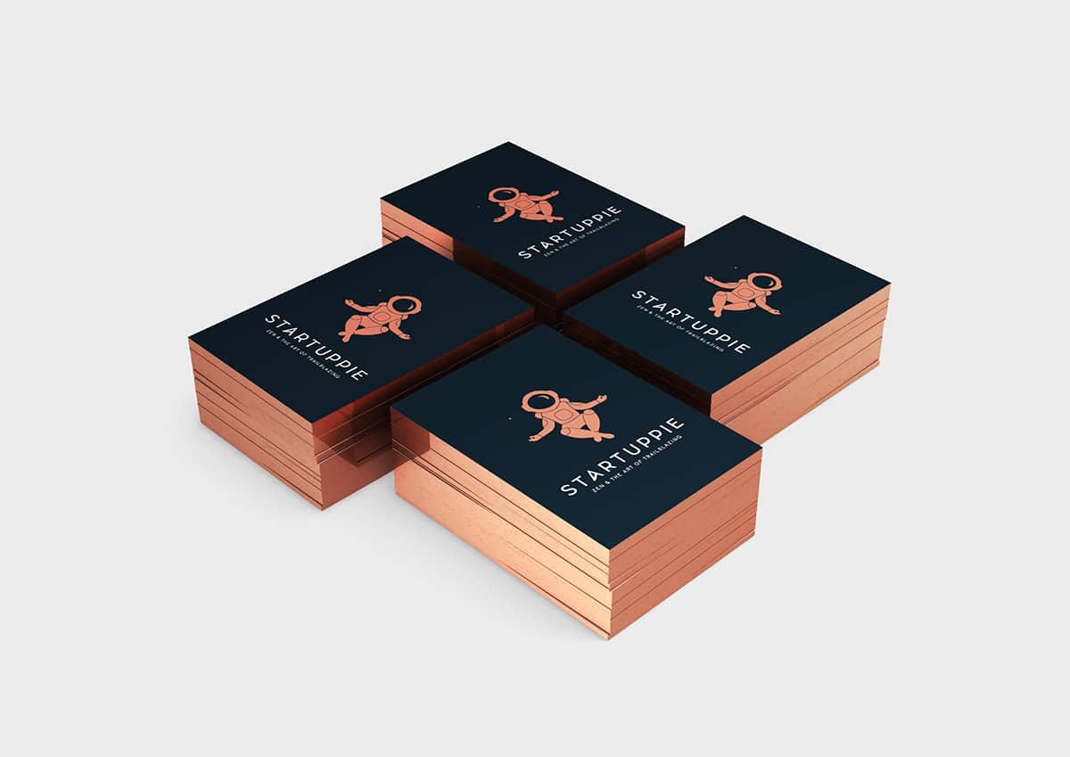
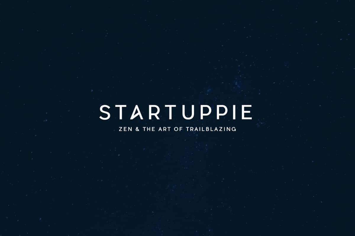
The slogan ZEN & THE ART OF TRAILBLAZING is meant to highlight the most significant attribute of startups and startuppie: being an innovator, a pioneer, a trailblazer— like an explorer of the space. And the slogan is supposed to transmit is: while any startuppie is somersaulting in suspense, puzzled by how to stand firm on their feet, there is no need to stand at all—one can find zen even in this confusing state of uncertainty. With the help of some tips, lifehacks and knowledge that we provide, though.
The slogan also refers to the famous Zen and The Art of Motorcycle Maintenance—a bestseller book by Robert Pirsig. This allusion to a well-known phrase that long ago had become a meme, adds more catciness to the motto. And a bit of an irony. The story of the book is relevant too: being rejected by publishers 121 times (the fact placed it among Guinness World Records), it had became a bestseller. Isn’t it a story of a successful startup?

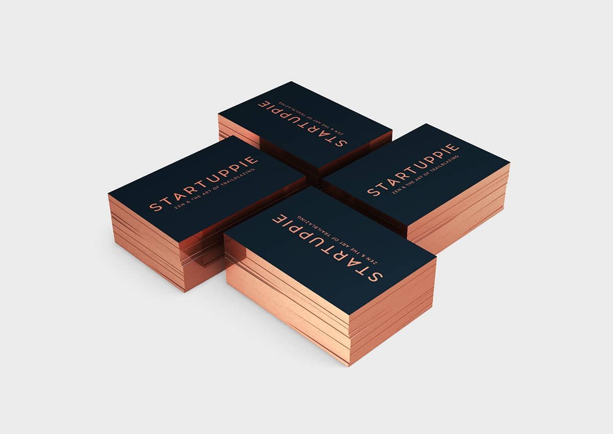
Base colors are Pink Bronze, Bright Red and Infinity Blue.
FONT
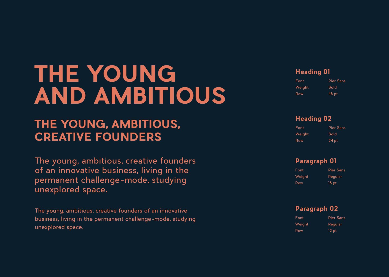
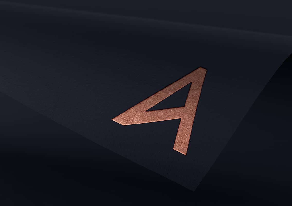
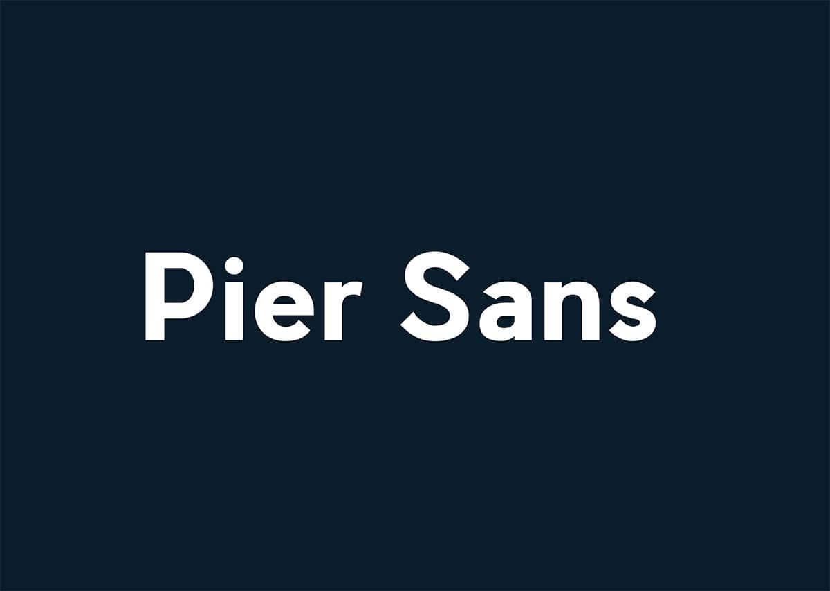
According to the brief, we have picked up a minimalist, moderated, well readable font. We’ve customized some letters, including A, slightly resembling a star now.
