

The task was to create brand IDs for two projects of the same owner: the Saint Petersburg based seafood bistro named GREBESHKI (‘scallops’ in Russian); and the next door art space SNEZHKI (‘snowballs’ in Russian) meant to be a multifunctional event hall. As you may see, there is no straight connection between these two notions — snow and shells — unless the latter are being delivered from the northern Russian city Murmansk, and both Murmansk and St. Petersburg are snowy northern cities. So the challenge was to connect these two names and nature’s phenomenons in one style and aesthetics — for it would be kind of illogical to have two totally different brand IDs in the same building.
When we started to develop the idea, we got surprised by how trivial most of scallop based logos are. We had to invent something what has never been used before, or at least would not be so overused. Keeping in mind St. Petersburg as the art capital of Russia and the venue itself, which is too elegant and sophisticated to use superficial images and associations, we turned to the classics.
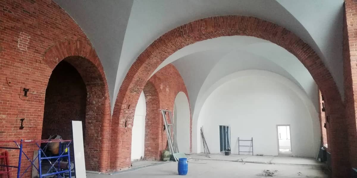
Venue
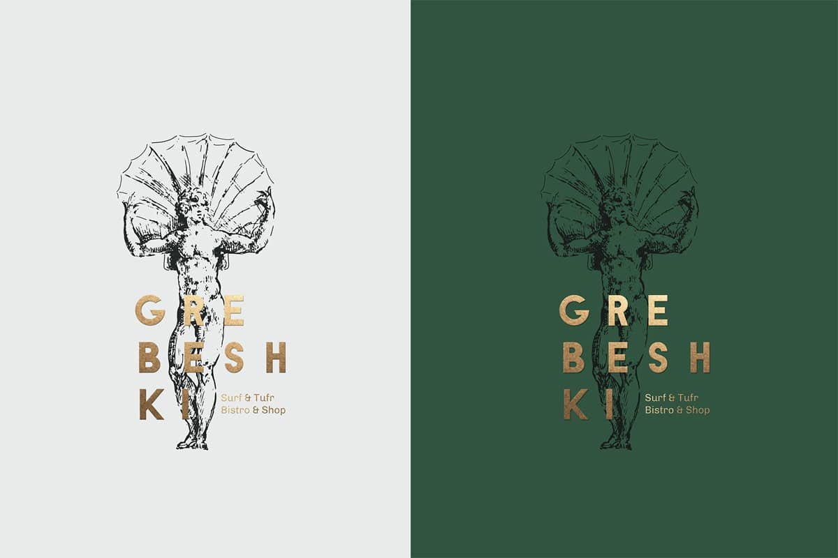
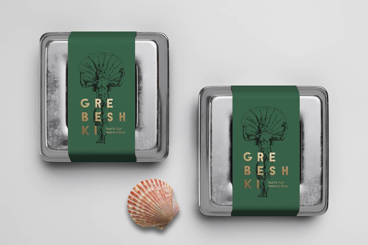
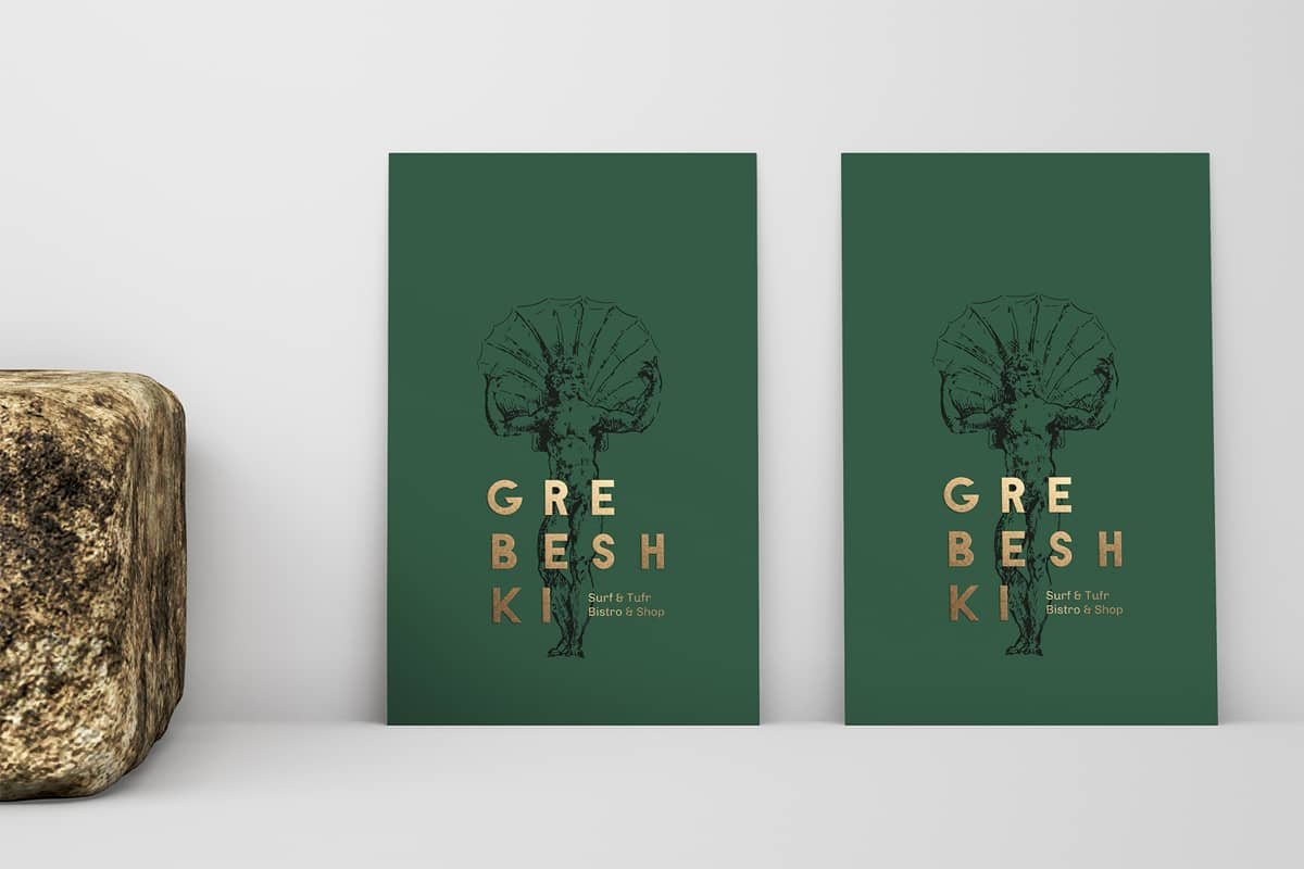
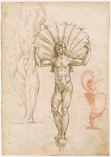
The concept for the GREBESHKI’s brand ID is based on the drawing of the famous 16th century Italian sculptor Benvenuto Cellini. His drawing of a man holding a huge shell seemed to us the most unusual depiction of a scallop so far, let alone we are in love with Italian Renaissance (who isn’t?). So we retouched the original image and laid a simple modern font over it — the 3-line composition (the client’s wish) was meant to give the logo contemporary, bold and a bit of hipster-ish vibe.
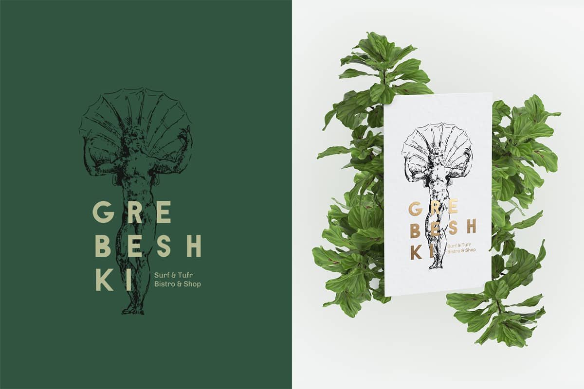
We suggested a few colors that could go well with food in general and seafood in particular — like, for instance, the noble pine green and gold.
After finding the idea for GREBESHKI there was a challenge to find another one for SNEZHKI that would be relevant, aesthetically connected and from the same epoch.
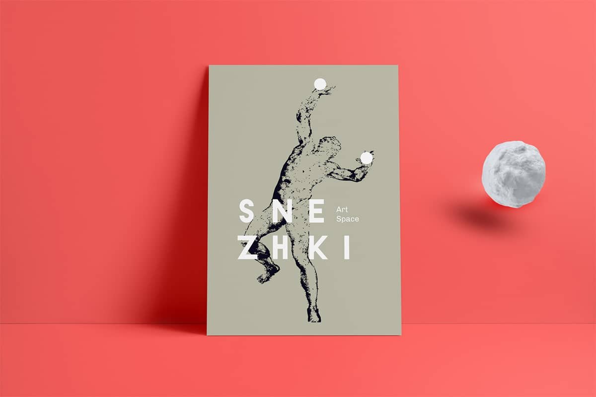
The concept of the SNEZHKI’s brand ID is based on the 15th century drawing of a famous Italian sculptor Michelangelo Buonarroti, widely known as Michelangelo. We altered it a bit and put snowballs in the hands of the The Risen Christ (may God and The Master forgive us!). We chose to visualize the name’s snowballs because they are sort of a trademark Russian winter game and is associated with joy, fun and entertainment — all what the project is about. But we did it in our own playful way.

We used the same font and composition principle.
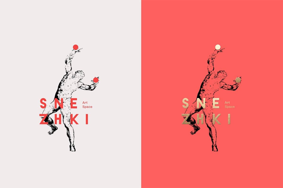
As to the palette, we were obliged to use white here. But we complicated it a tad and combined with bright watermelon red and, again, gold. Using different textures in print — like golden foliage along with monochrome graphics — could amplify the effect.
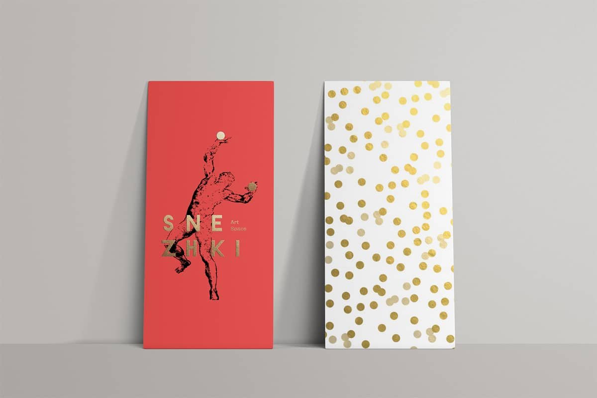
The polka-dot pattern in the ‘snowballs’ context could look very nice and fresh.
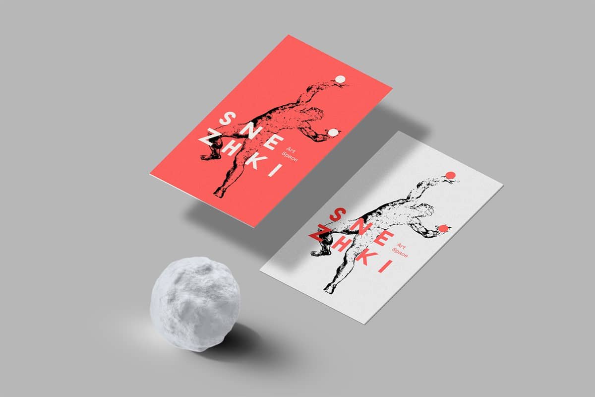
We’d thought that this concept not only matches the white and snowy St. Petersbourg as the major context, but also the architectural style of the venue, its noble classic aesthetic and laconic interior; being the contemporary ironic interpretation of it and at the same time giving it the necessary artistry and playfulness.

Unfortunately, it didn’t work for the client and we went into rounds and rounds of searches of something more simple until we gave up and admitted we are not able to meet the expectations. But we do really love this particular concept and would love to present it here.
THE CONCEP IS FOR SALE.


