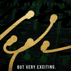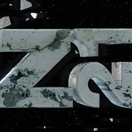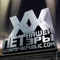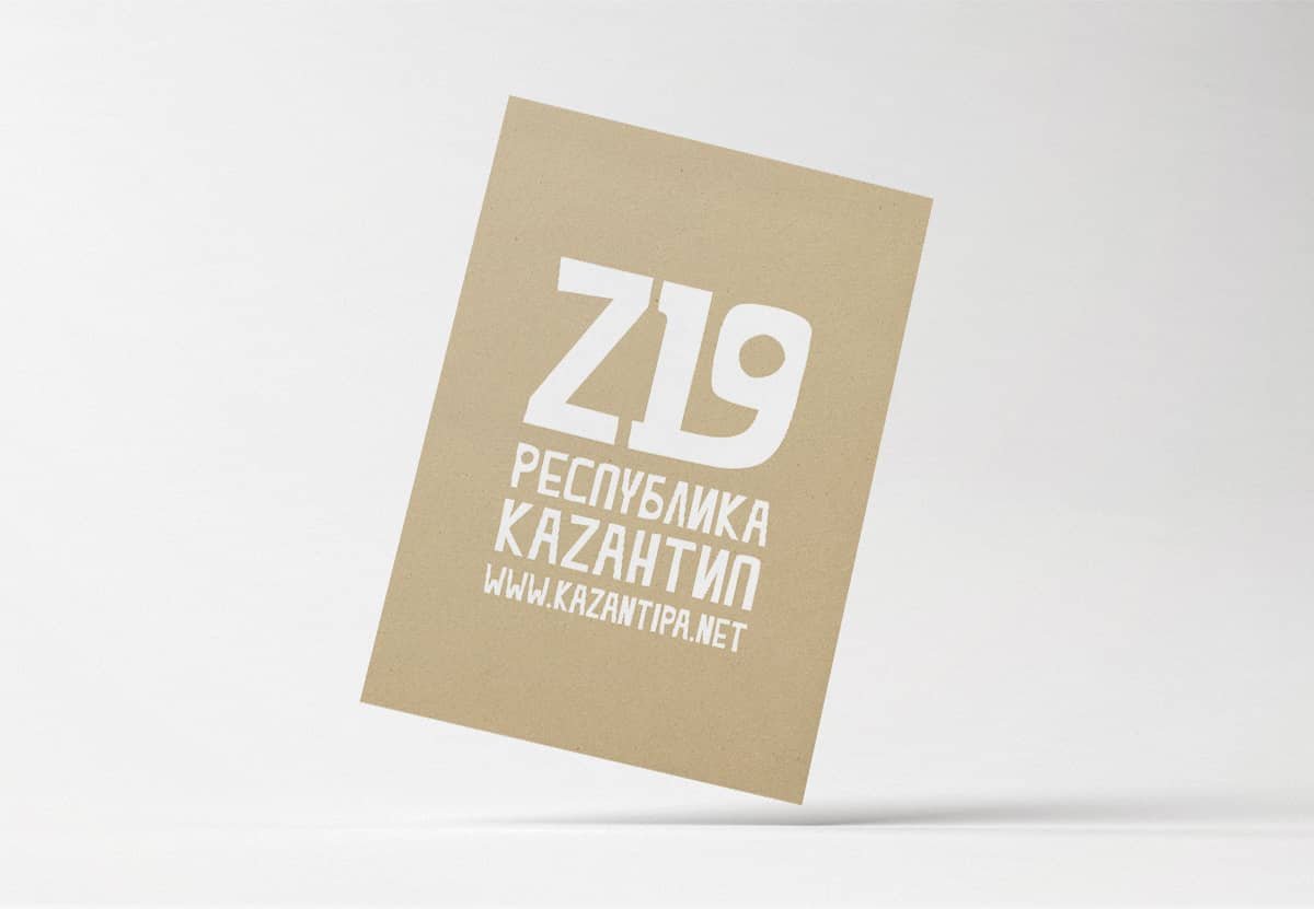
It was a long-time tradition of The Kazantip Republic to have a new brand ID—font, logo, slogan—every year along with a new season’s theme. Changing a well-known and recognizable for something fresh and unknown used to complicate our life a bit, but, luckily, after a few years of such re-dressing we could afford it and it prevented us from getting boring. The year 2011 wasn’t an exclusion and changes that started with the new font ended up with the totally new, modern, look of the logo.
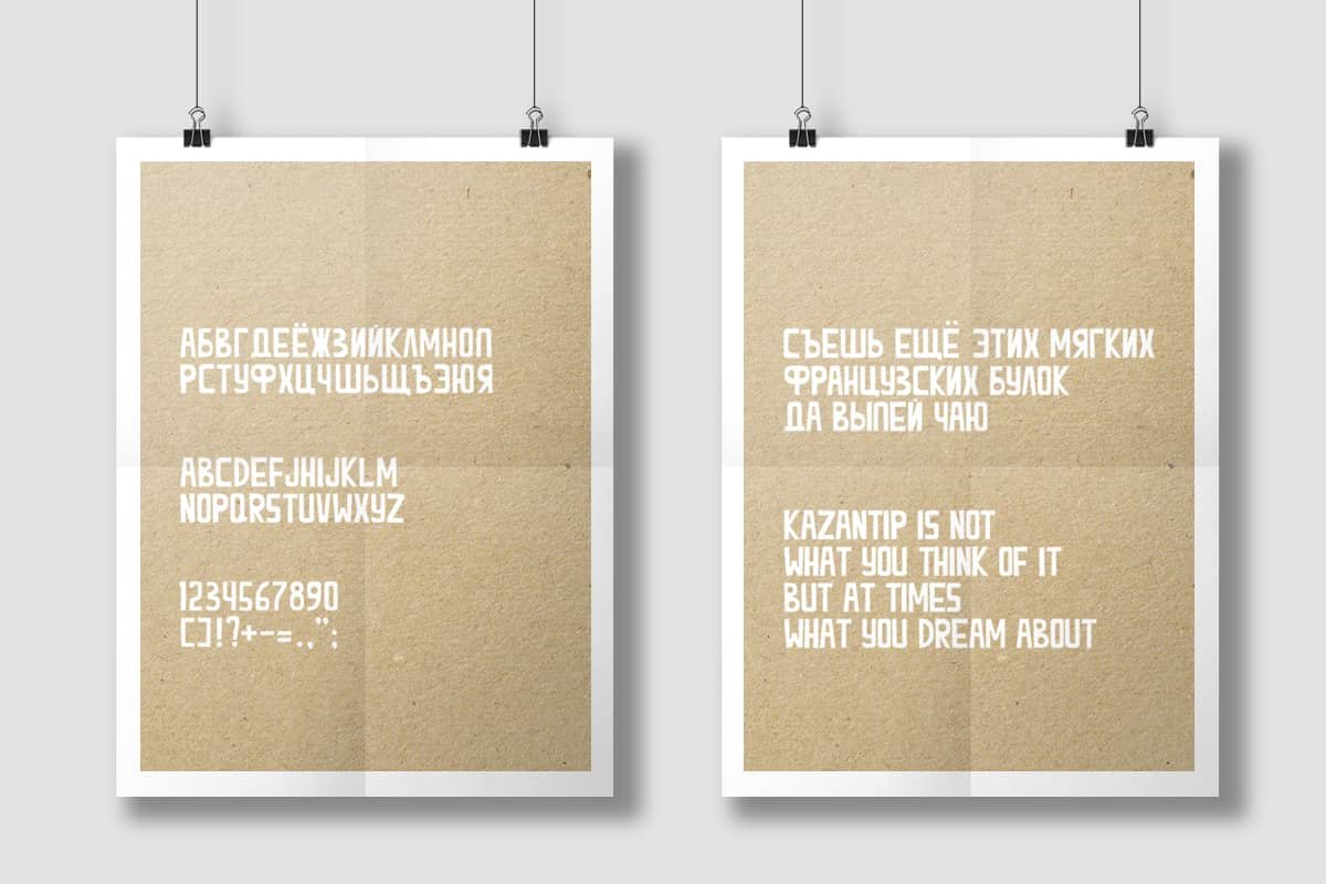
Logo, font
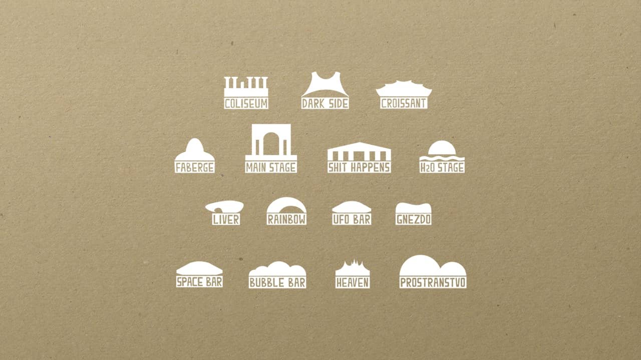
Infographics: stages and dancefloors
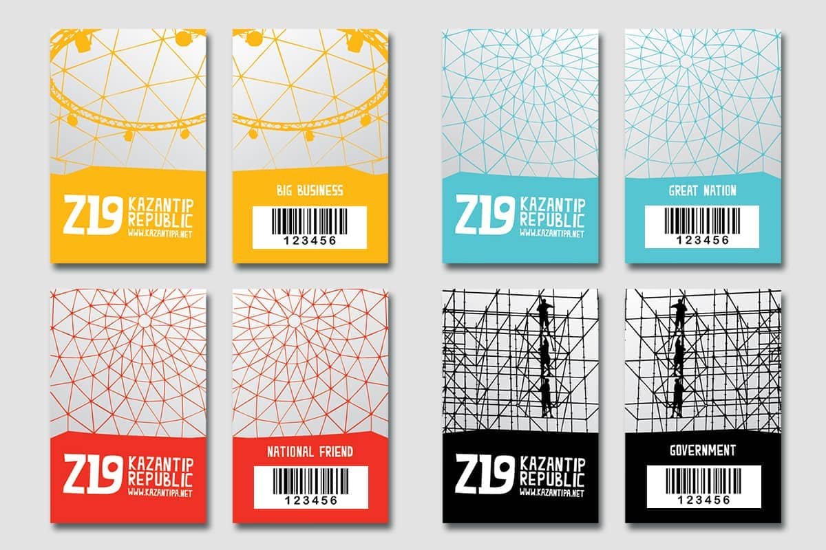
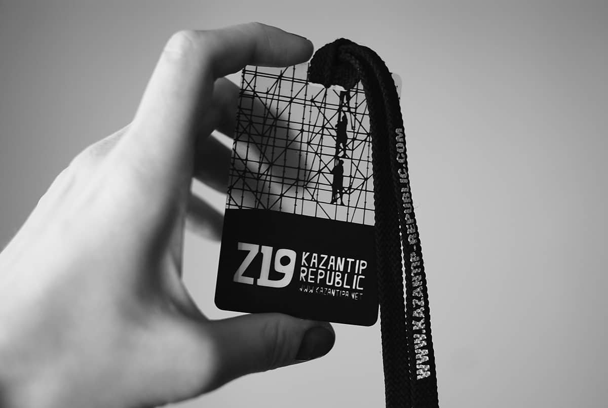
Viza — an individual plastic card with the barcode, granting its owner the right of entering during the entire period of the festival. There are a few categories for guests, workers, tech crew, organizing committee, etc. Elements of key stages and architectural objects were used in design.
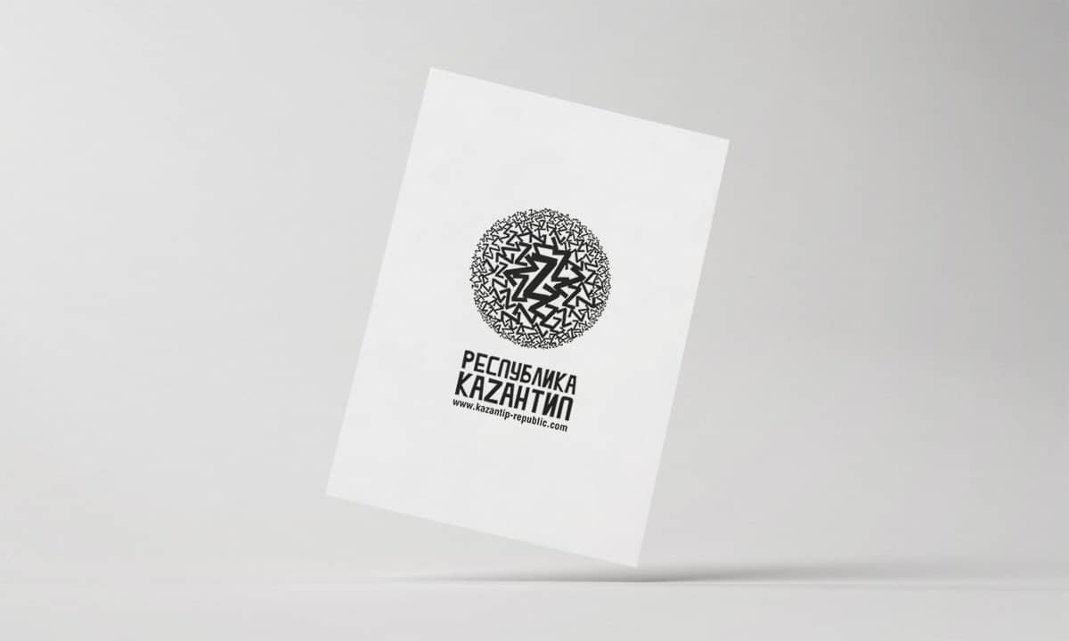
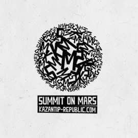
Renewed logo was presented by a volume sphere made of numerous Z letters of different size, and in a way symbolized the idea of ‘The World Supremacy’ that was a part of The Kazantip Republic’s ideology and, well, the marketing strategy.
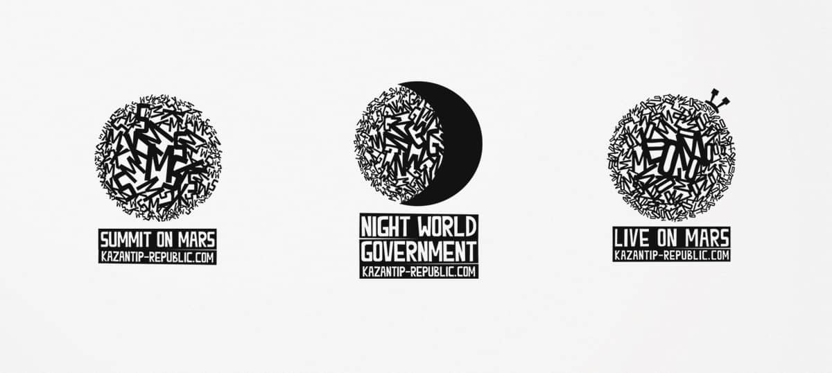
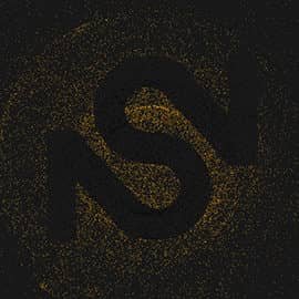
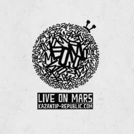
Summit on Mars, Live on Mars, The Night World Government and AWE were Kazantip Republic’s sub-labels and special events, and it made a lot of sense to redesign them accordingly to the new concept too. The logo-sphere of Summit On Mars is made of K, S, M; the logo of Night World Government is made of N, W, G and emphasized by a silhouette of new moon. And the logo of Live on Mars—a festival of live music within an electronic festival—is made of K, L, M and topped with a tiny antenna as a Mars rover would have.
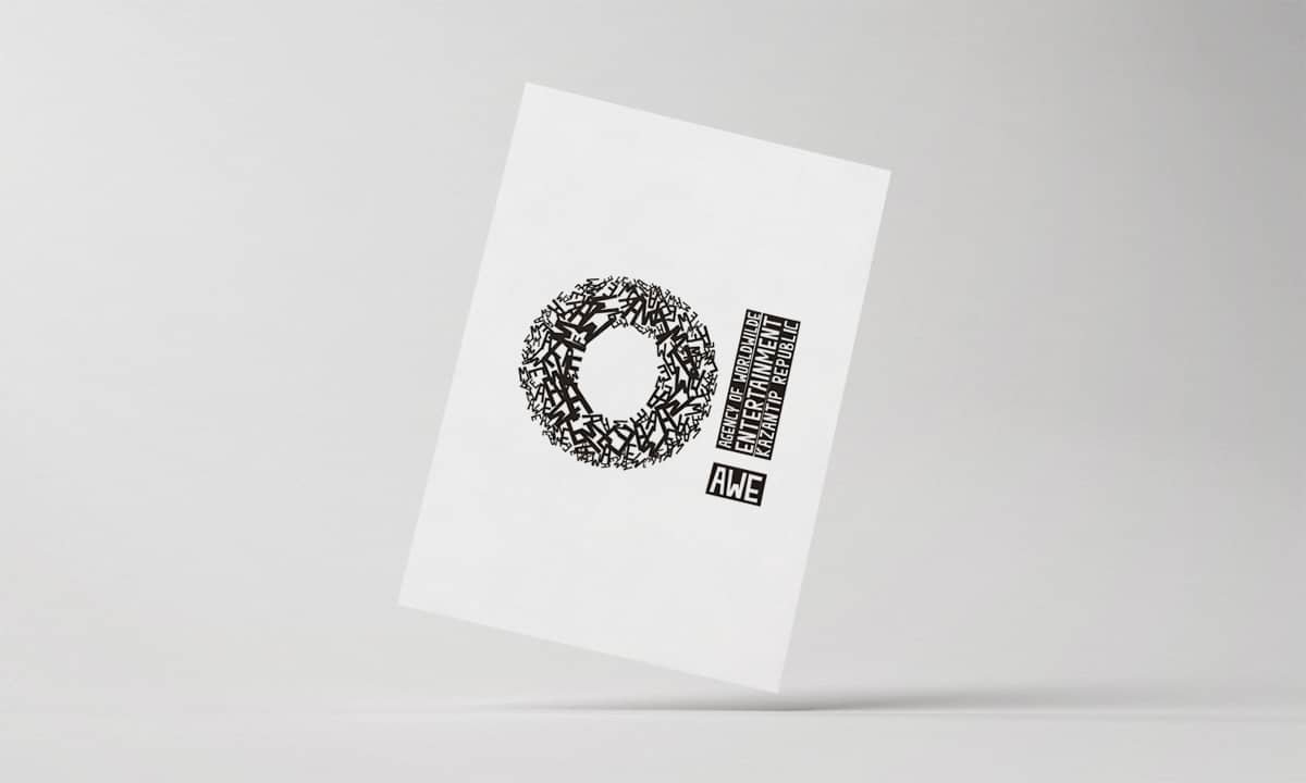
Abbreviation AWE (Agency of Worldwide Entertainment) was visualized by ‘O!’ made of its set of letters, because this is the way ‘awe’ is being pronounced and ‘!’ is the desirable reaction of the audience.
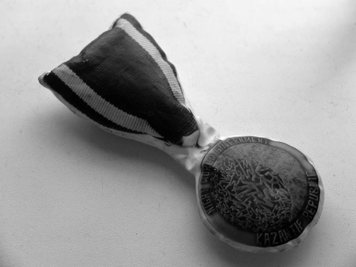
The toy-ish medal, a sign of belonging to the secret lodge of The Night World Government, that was supposed to become a secret international organization consisting of influential nightlife activists. Limited edition of them had been handed to a few honored figures of the club industry.
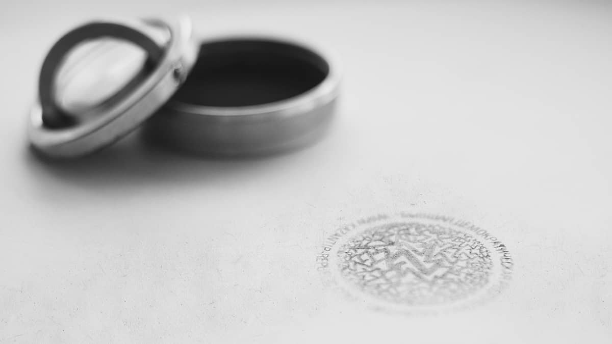
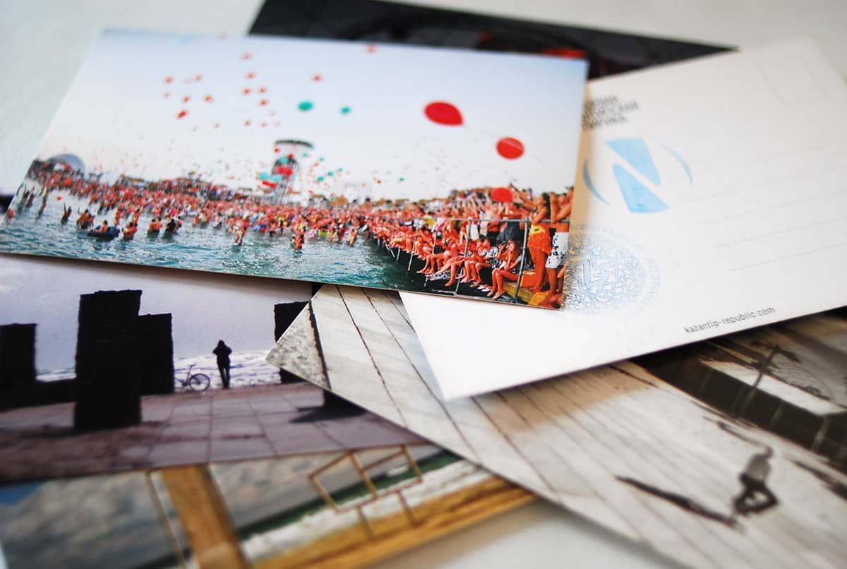
Stamp of The Kazantip Republic
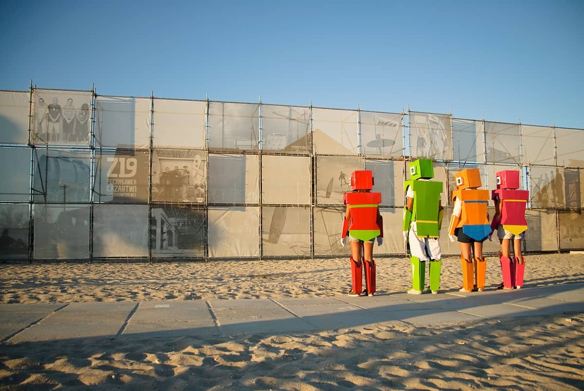
Banner wall
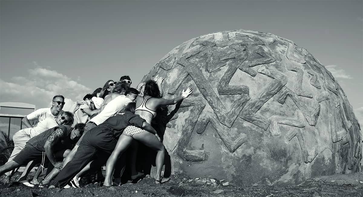

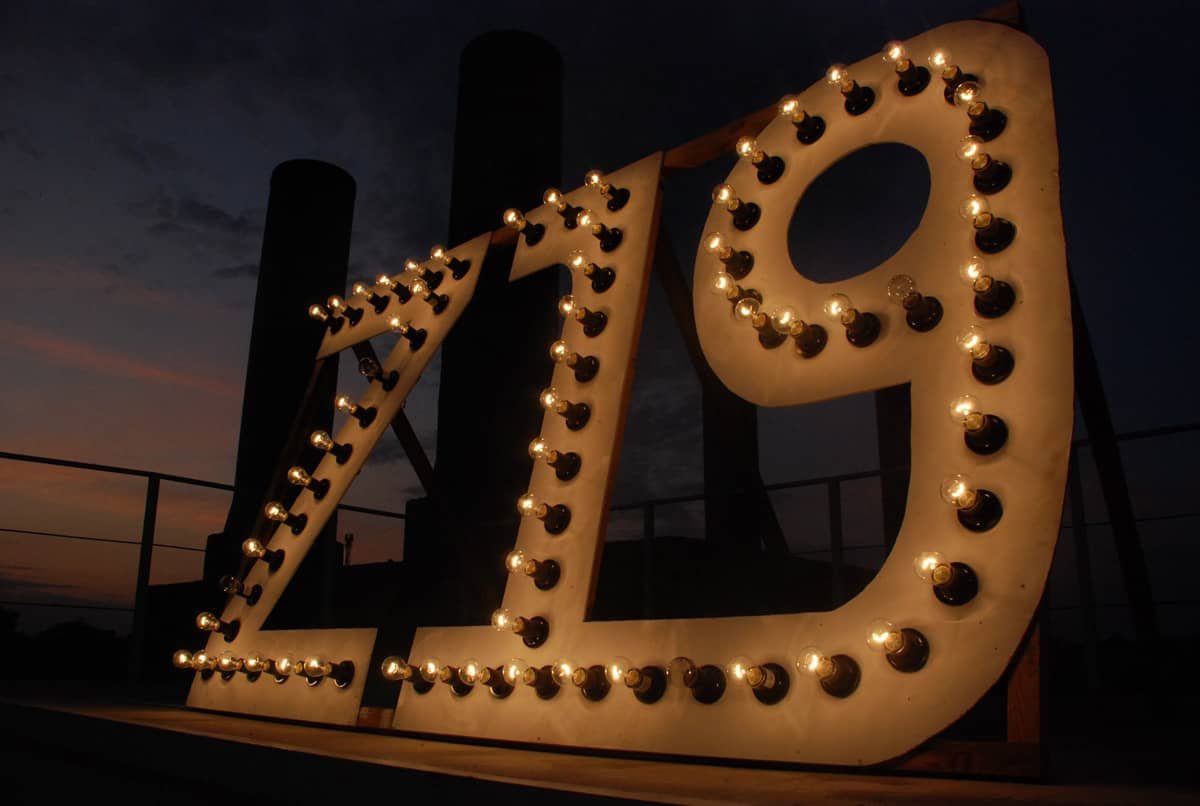
The installations based on the logo
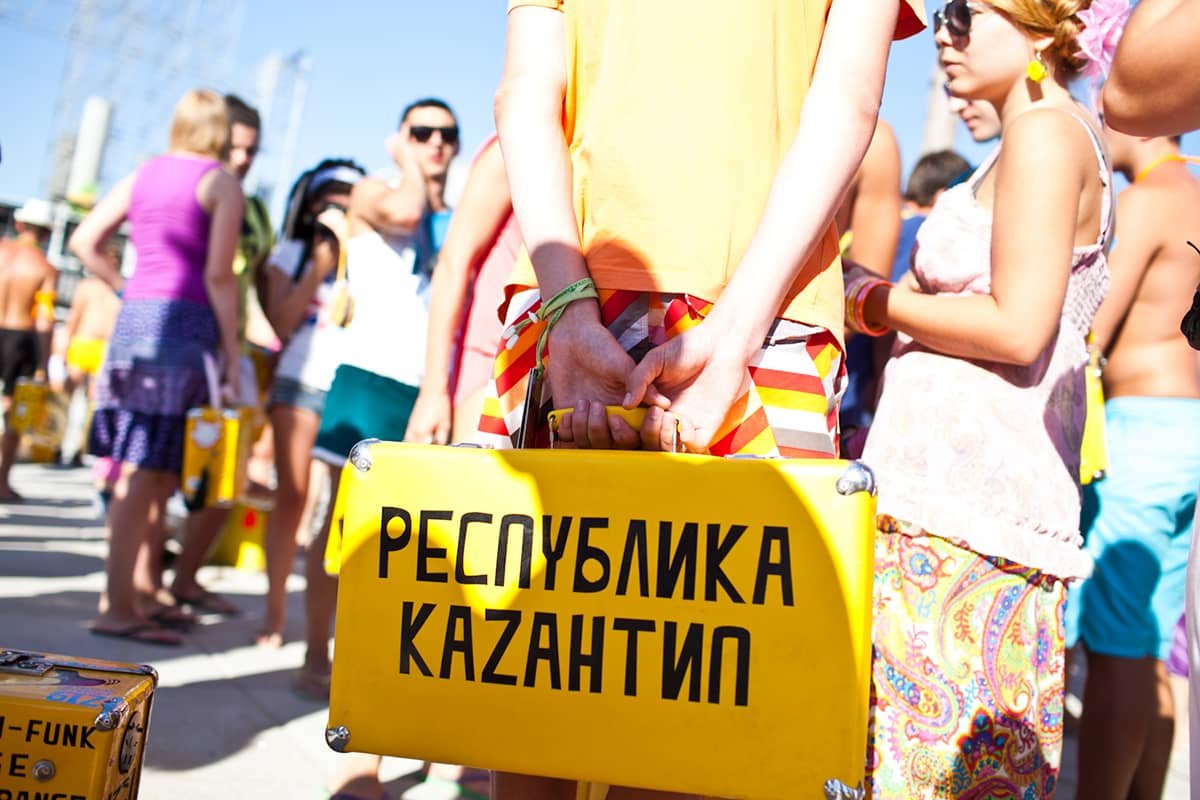
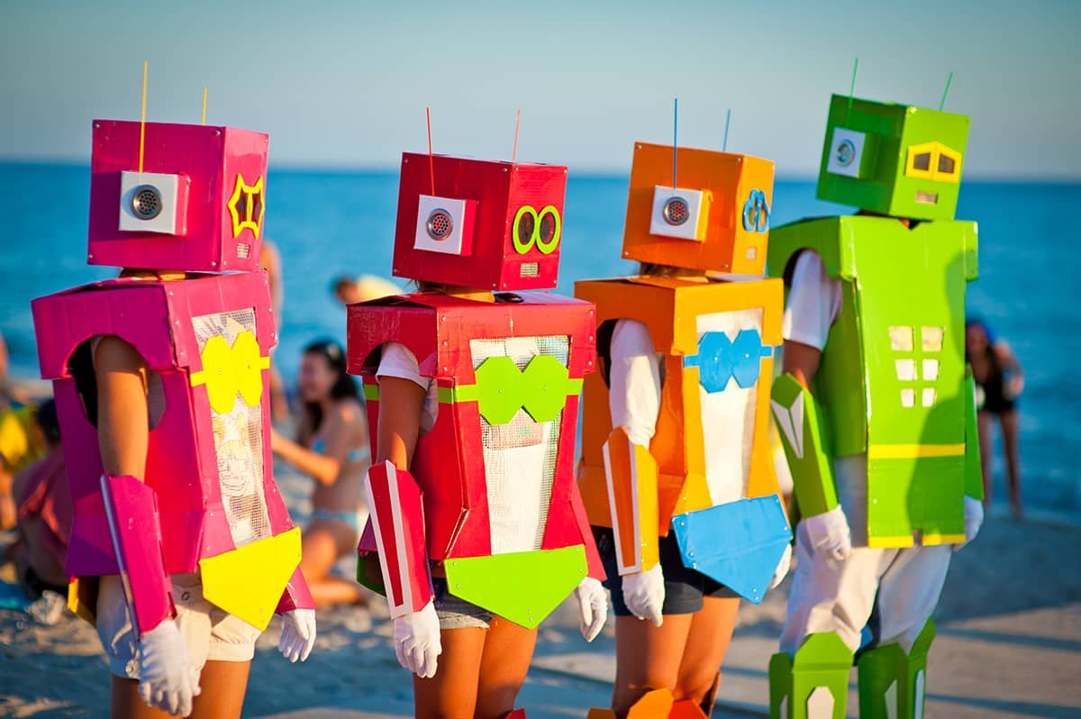
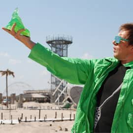
Robots were the theme of traditional May Demonstration (of happiness)
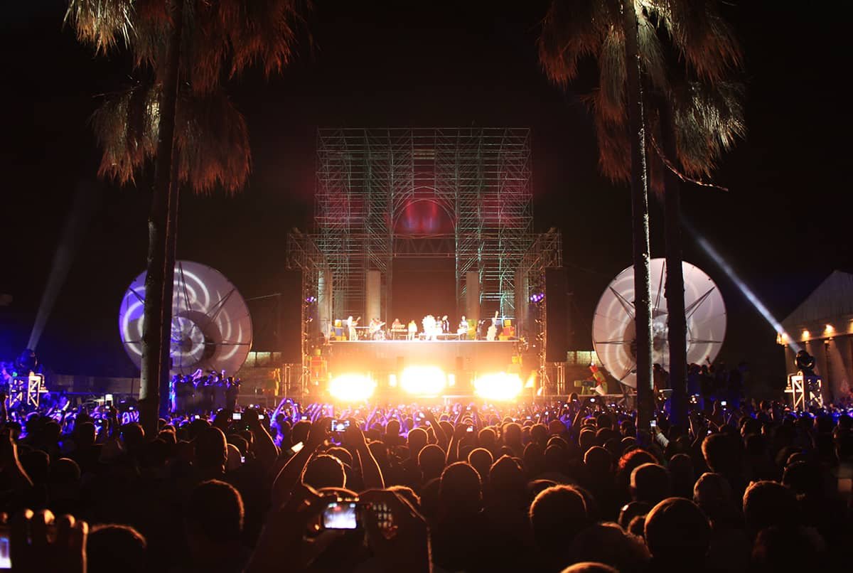
Opening Ceremony
Credits:
Mara Fauque — design, web-design, visual solutions, photo, content moderating, art directing.
Oleksandr Demianenko — video production: directing, camera, cut, sound, movie fest curator.
Natasha Kto Nado — creative director, copywriting, pr and marketing communications.
Andrew Kozelkov — sound & light equipment, technical conduct.
Nikolay, Daria and Katerina Boychenko & D’Arts Ballet — dance support, performances.
Artem Harchenko — anthem, sound producing; live stage, booking, management.
Matthew Hoag, Yury Marychev — lineup, booking, music department.
Maxim Bobrov — programming and system administrating.
Vladimir Ermolov and Verteco — tent constructions, stages.
Peter Shvets-Shevchenko — the venue producer.
Nikita Marshunok — general producer.
Andrew Goshva — international and local PR.
Global Publicity — international PR.
Elgar Yusupov — camera, sound producing.
Maksim Melnik, Andrew Reva — camera.
Vadim Epstein — VJ-ing, video-support.
Dmitry Oparin — photo, video.


