The WP-based site for our friends and allies, the creative duo Freak Fabrique. The task was to create a minimalistic and convenient portfolio for the design studio with the wide range of specializations: architecture, design, land-art, venue planning, stage construction, event decoration, art installations, recycling, etc. There were a few specifics: the mix of compact and massive long-term projects that could not be presented a same way; and non-homogeneousness of material: instagram-sized phone pics, lomography-styled film photos, professional photo reports.
We’ve offered a classic main page with a multifunctional header/slider and a few dozens of featured projects. (A ‘finite’ scroll is presented by ‘+’). All relatively compact works are presented in Portfolio under several categories. The big and complicated projects are presented separately, as detailed Cases with long descriptions and in-built slide-shows.
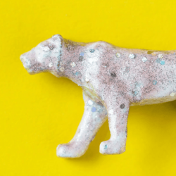
For the top slider we have chosen images of the projects representing the studio’s core attributes: conjunction of ecology and technology, impressive simplicity, and art-approach in the frame of big events.
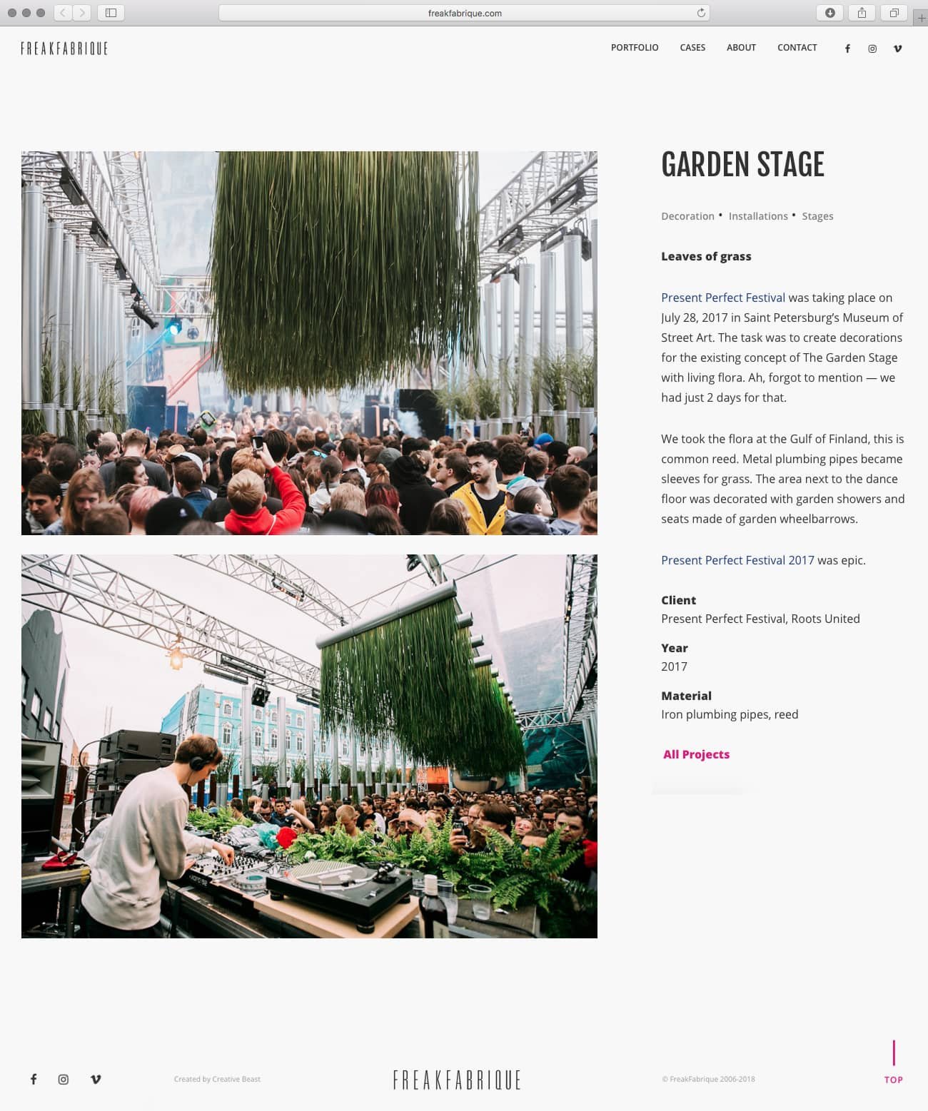
The problem of non-homogeneous photo material is solved by several styles of publication, available in the portfolio. The photos can be posted in a full-width mode, in a small size, and in a few different grids — depending on their quality. At the same time, the general style of the page remains the same.

Aside of Freak Fabrique’s outstanding creativity and huge talent, there is another, very charming feature of the project — the powerful duo are two humble petite girls, doing a lot of hard construction work by their own hands. Using selected pictures on the main page we have tried to create a visual narrative highlighting this peculiarity and supporting their motto — CONSTRUCTION & CREATION. So there you can see some emotional and palpable backstage working moments, along with already implemented conceptions.

Another detail we have added to stress out the duo’s creative coherence is tiny drawn silhouettes of two synchronized swimmers from a Soviet era book — this is one of the FF’s favorite aesthetics. Swimmers appear on the main page in trademark pink and dark blue colors, and also on secondary pages in the form of background pattern. Pale pink keeps the text readable, giving the laconic site a bit of girlish and pop-artish fleur.


