
GLOBAL INNOVATION CATALYST (USA)
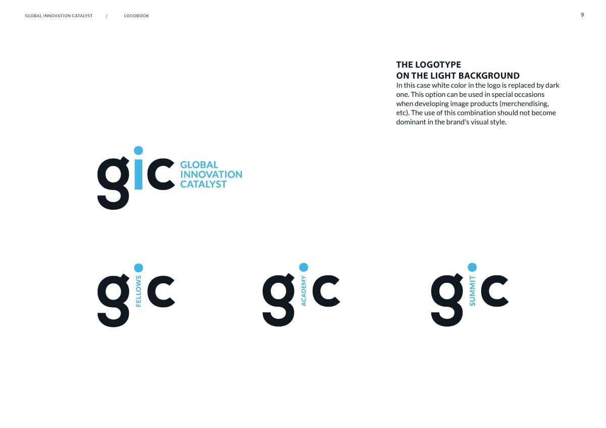
Global Innovation Catalyst aka GIC is a California based advisory services company with the mission of supporting the development and creation of innovation ecosystems around the world. The company has a few departments focusing on different kinds of activities, such as: events (GIC Summit), educational programmes developed in partnership with Stanford’s Center For Professional Development (GIC Academy), and — one of the most important — the global network of innovators (GIC Fellows). So our tasks were not only to remake the existing logo, but to include all these sub-labels into the brand identity.
The key target audiences of the company are: governments, corporates, entrepreneurs, tech startup, ecosystem enablers (fellows), and academic institutions looking for a complete curriculum.
Developing the brand ID, we should have considered all the client’s requirements to it:
- the logo should be not too funky, but stylish and innovative.
- be easily comprehended by governments, corporates and fellows.
- convey fresh thinking, credibility, dynamism, global, cutting edge.
- the ‘GIC’ abbreviation should be in focus.
- be rather laconic (as Y Combinator, 500 Startups).
- there should be a bright color accent.
The challenges we’d met:
1. The amount of words that should have been put in the logo (the 3-word descriptor + the department title) opposed the idea of desired minimalism.
2. The key element of the logo—the GIC abbreviation—didn’t look really great in upper case and resembled something as pop-ish as the Dolce & Gabbana’s logo;)
The solutions:
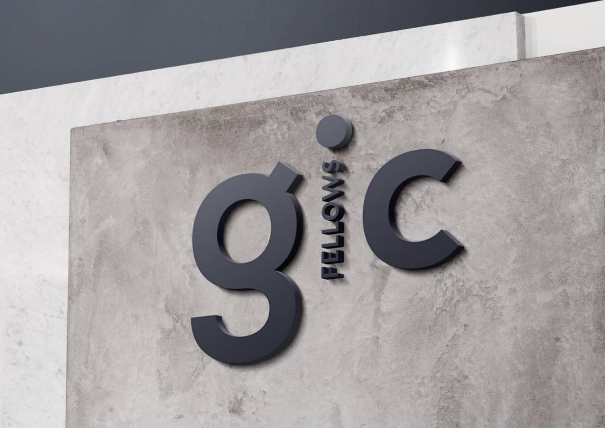
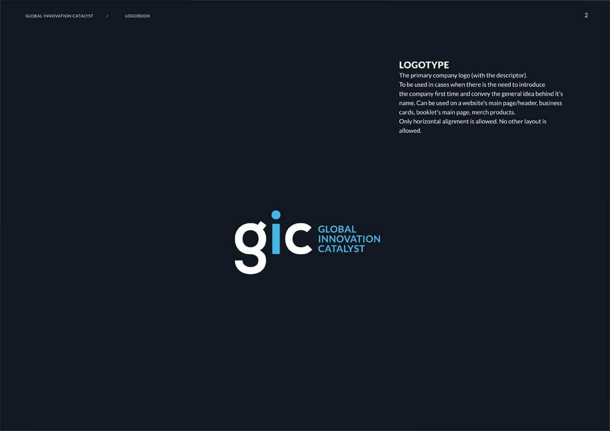
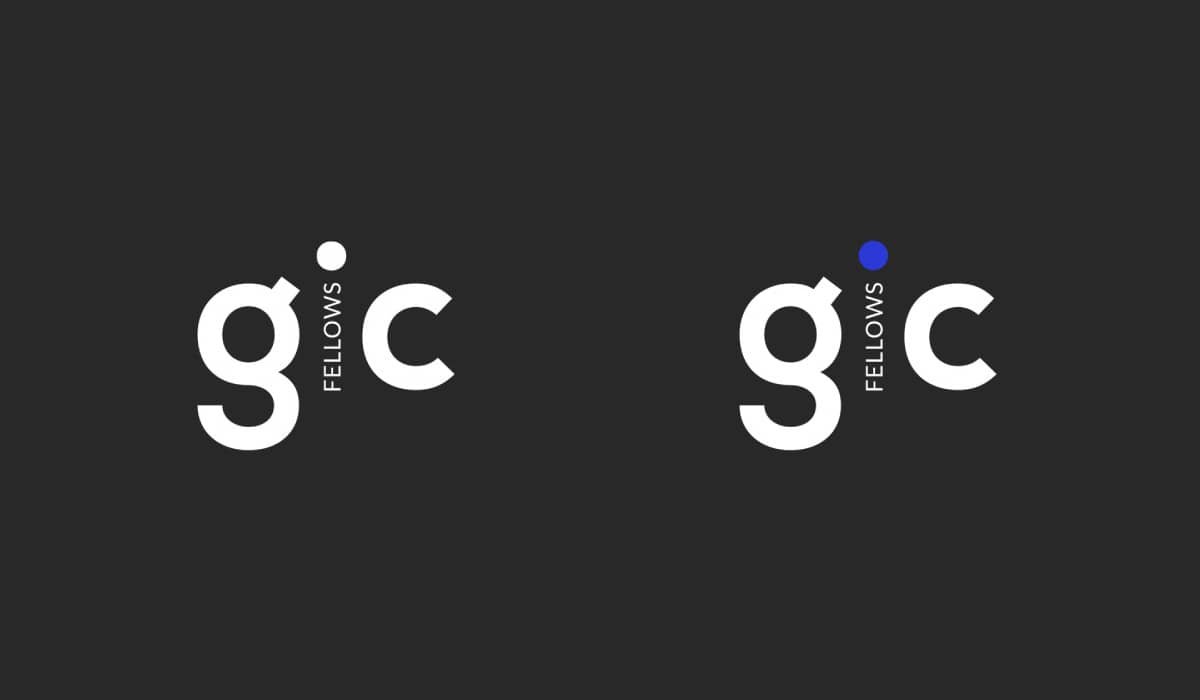
In order to make the logo look laconic (as much as possible) we suggested to use two variations of it: the primary logo with the long descriptor giving an observer the idea on the company’s specifics; and the secondary one — for the use in the context of a particular department.
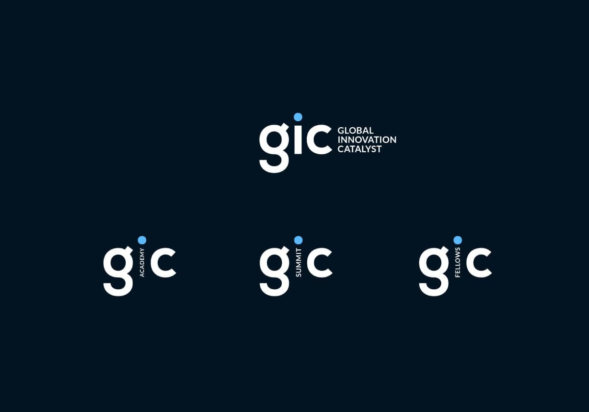
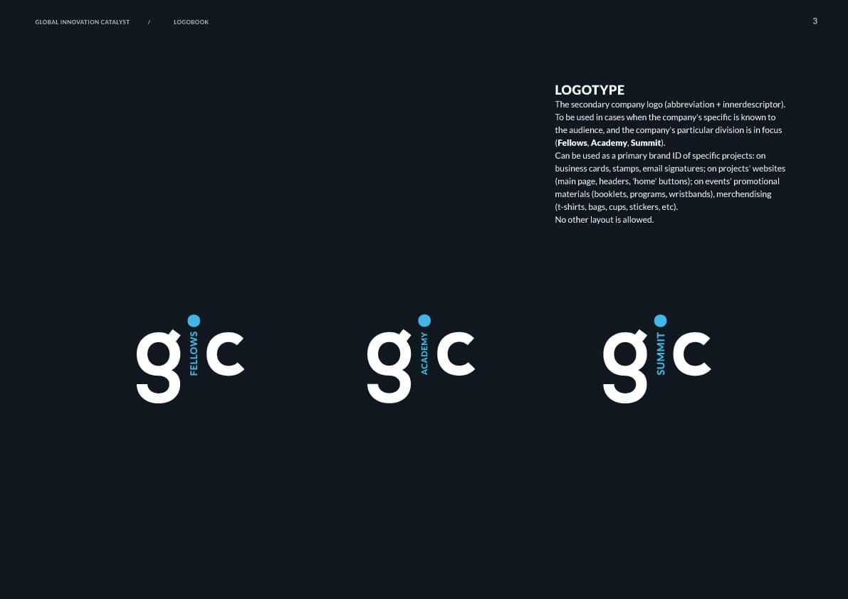
The problem of the not very nice-looking abbreviation has been solved by using the lowercase and fonts with the photogenic ‘g’ letter. The lowercase ‘i’ is also much more interesting and gives more possibilities to play with the color accent and the composition in general.
 We used the simple and contemporary font Lato from the previous option of the logo, but in the upper case. To combine it with the lowercased abbreviation might not be the most classic solution, but we liked it and this was a way to balance a bit too informally-looking ‘gic’.
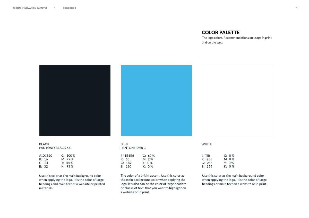
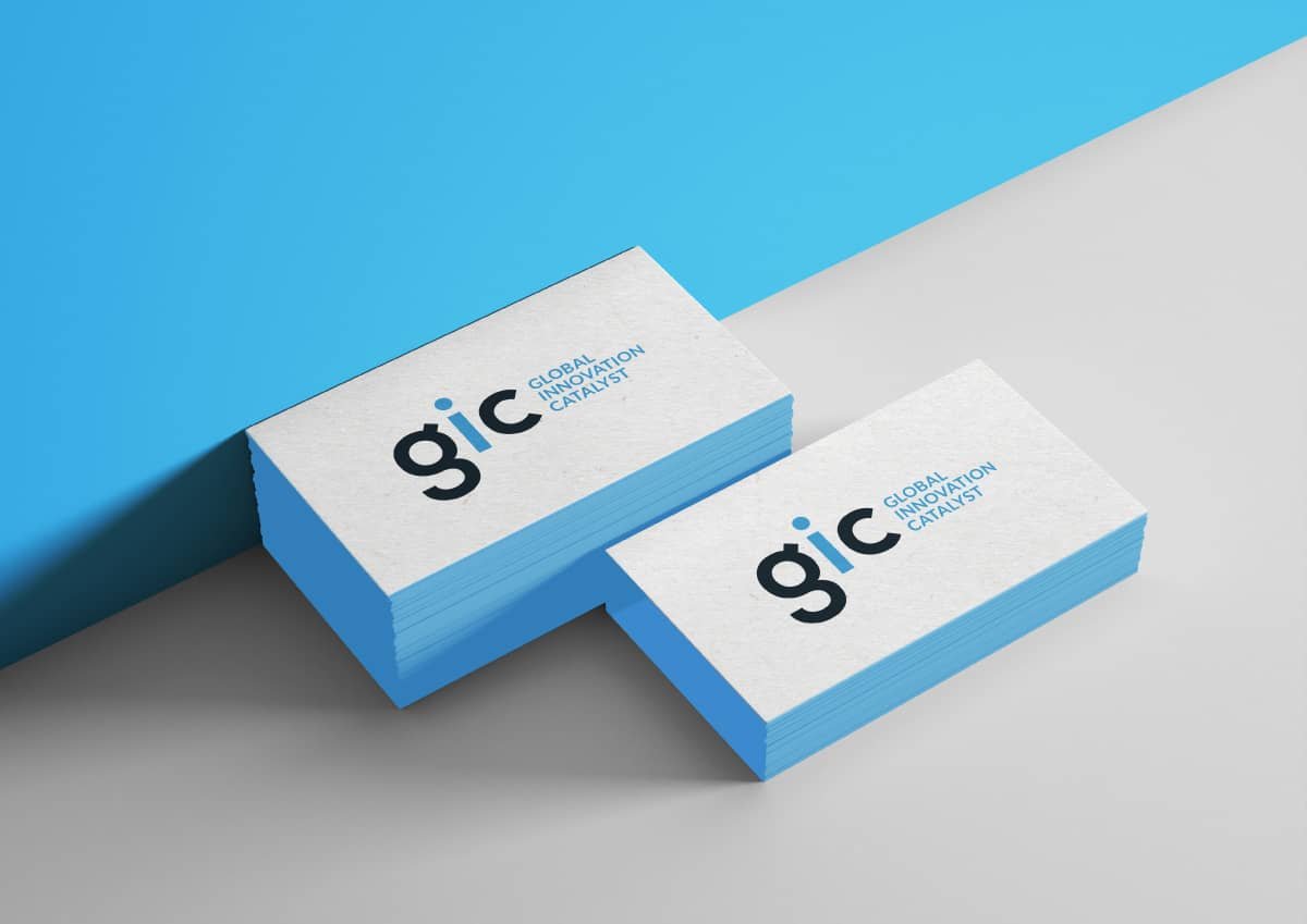
The color palette the client was inclined to is black & blue, so we offered a few shades of the latter — and here is the winner, moderate, classic and classy.
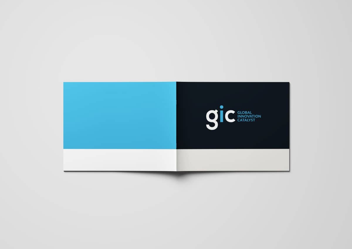
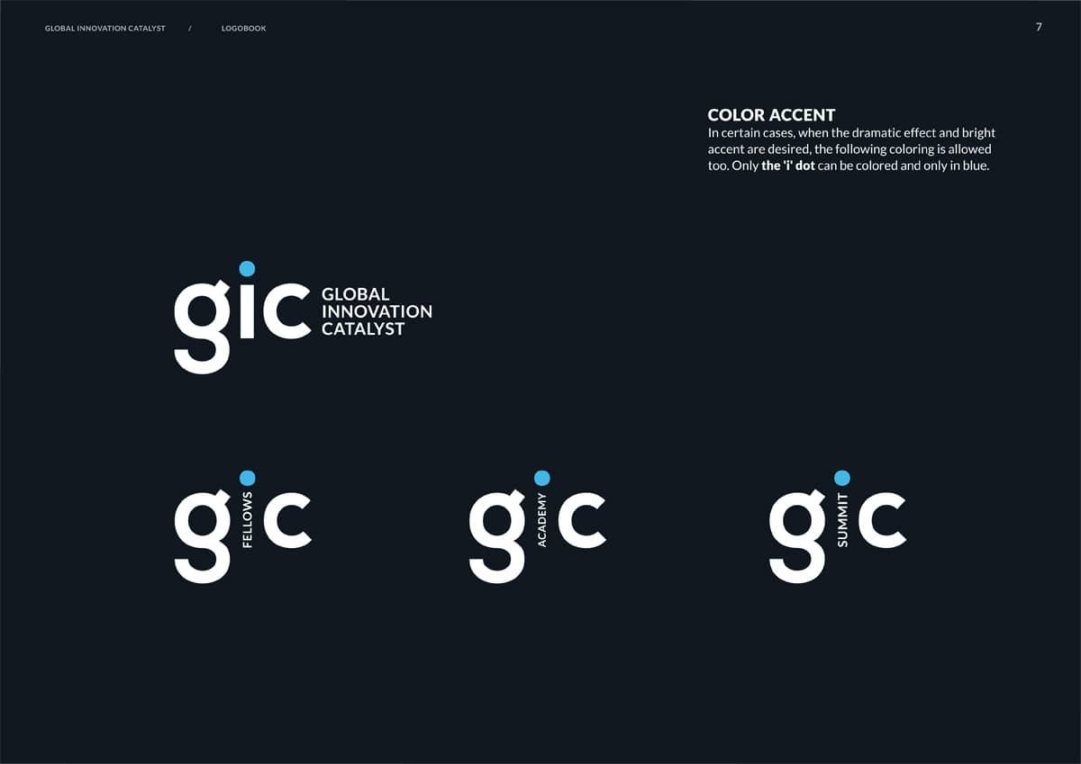
We have offered minimalistic color accent, and albeit the client insisted on more noticeable presence of blue color in the logos, we still kept this option as the recommended one.
It’s worthy to mention, that this is one of the most quickest and smoothest projects we have ever done — it was completed in 3 weeks. And in spite on a several decision-makers and a few contradicting points in the brief, the working process was full of respectful exchanges of opinions, constructive compromises, trust and collaboration. The both sides are totally satisfied and we wish the fellas all the best!


